
Brand Colours lets you skin the entire WisePub app in your own palette. You pick a base colour for your primary and secondary brands, and WisePub generates the full 11 shade ramp used across every button, link, badge, and menu. You can optionally give the sidebar its own colour, define a completely different palette for dark mode, and choose the exact gray tone dark mode uses for backgrounds and cards.
Everything is previewed live before you save, so you can experiment freely without touching the real site.
What You’ll Learn
By the end of this guide, you will know how to:
- Pick base Primary and Secondary colours and see the generated ramp
- Give the sidebar its own colour
- Turn on a completely different palette for dark mode
- Choose the dark mode surface (background) tone
- Decide whether visitors default to light or dark mode
Prerequisites
- You must be signed in with an account that has the Manage Options permission (administrator role by default).
Where to Find Brand Colours
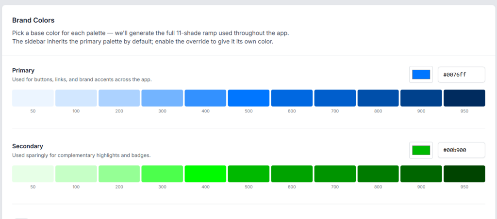
Open your Settings area and go to Brand Colours. The page opens with three areas: the settings on the left, a live preview on the right, and a Save changes button beneath the preview.
Setting the Primary Colour
The Primary colour is used everywhere the app needs to communicate action or brand: buttons, links, primary accents, active states, and focus rings.
- Click the small colour swatch next to the Primary heading, or type a hex value directly into the text field.
- The 11 shade ramp beneath the picker updates instantly. WisePub picks the exact hex you entered as shade 500, then generates progressively lighter shades (50 through 400) and darker shades (600 through 950) to give the app a consistent tonal range.
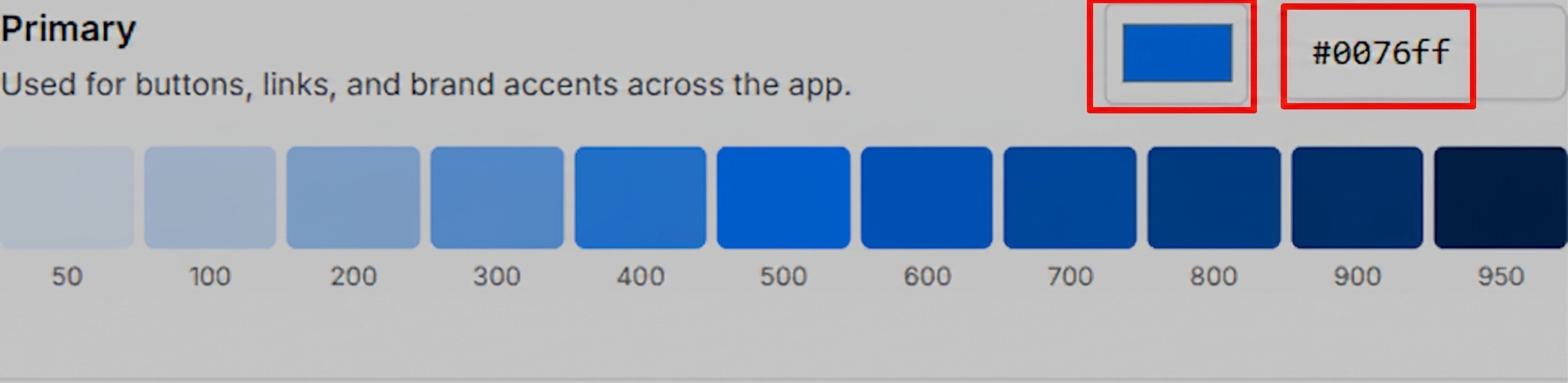
> Expected Result: The Primary buttons in the Live preview panel change colour immediately.
Pro Tip: Pick your brand’s mid tone (roughly the colour you would use on a large button). WisePub extrapolates the lighter and darker shades around it, so a mid tone gives the best balance across the app.
Setting the Secondary Colour
The Secondary colour is used sparingly for complementary highlights, like status badges, success states, and secondary buttons. It should visually complement, not compete with, the Primary.
Follow the same steps as Primary: click the swatch or type a hex value, and the 11 shade ramp updates.
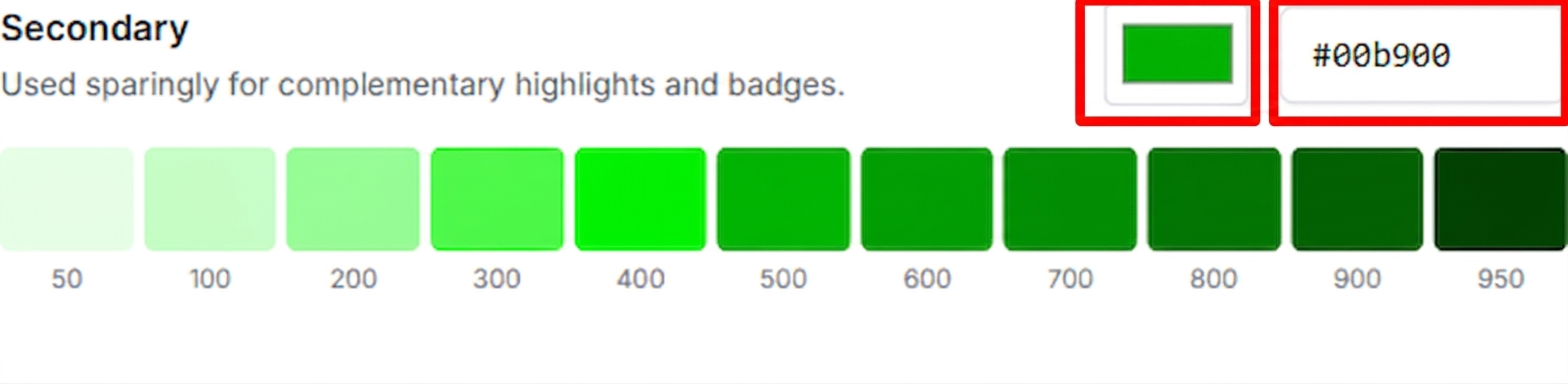
> Expected Result: The Secondary action button in the Live preview panel updates to reflect the new base.
Giving the Sidebar Its Own Colour
By default the sidebar reuses the Primary palette. If your brand’s Primary works well as a button but is too loud for a full height sidebar, you can override it.
- Find the toggle labelled Use a different colour for the sidebar.
- Flip it on. A new Sidebar section appears with its own colour picker and ramp.
- Pick a base colour just like Primary and Secondary.
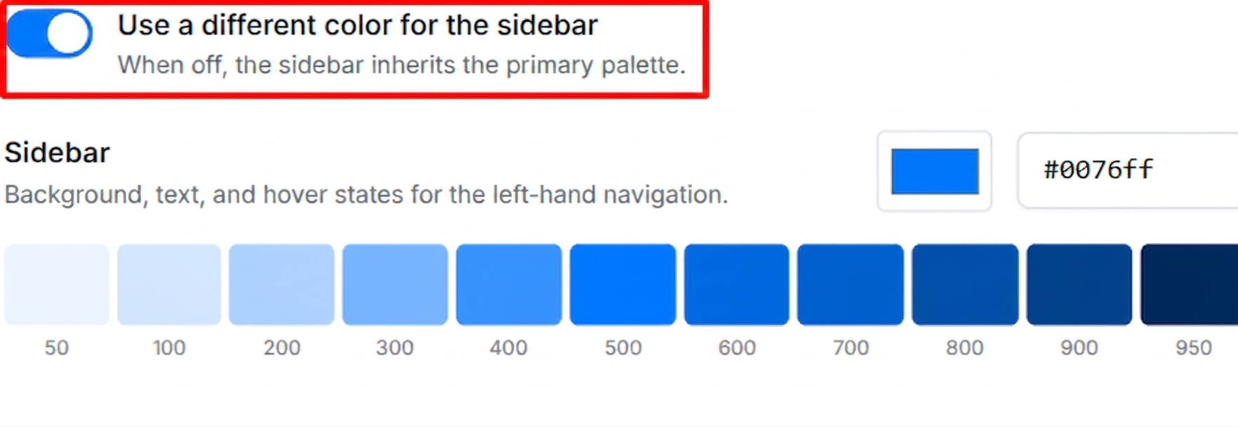
> Expected Result: The sidebar in the Live preview panel switches from the Primary tone to the new Sidebar tone.
Pro Tip: Deep neutral or navy tones (something in the 600 to 800 range) usually work best for sidebars. They provide contrast for the main content area without competing with the Primary buttons inside it.
Defaulting Visitors to Dark Mode
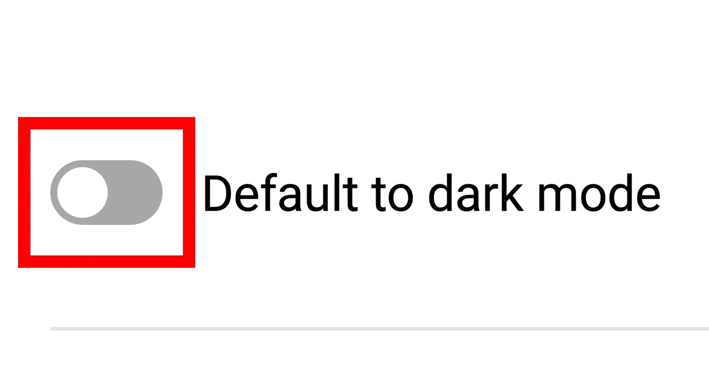
The Default to dark mode toggle controls what colour scheme a new visitor sees on their first page load.
- Off: New visitors start in light mode.
- On: New visitors start in dark mode.
Existing users who have already chosen a theme keep their choice regardless of this setting. Turning it on only affects people who have not picked a theme yet.
Using Different Colours in Dark Mode
By default, dark mode reuses your Primary and Secondary palettes. Some brand colours look great on a light background but poor on a dark one (bright yellows and light blues in particular). To fix that without changing your light mode palette, use the dark mode override.
- Turn on Use different colours in dark mode.
- Two new pickers appear: Primary (dark mode) and Secondary (dark mode).
- If your sidebar override is also enabled, a third Sidebar (dark mode) picker will appear.
- Pick base colours for each, just like the light mode pickers.
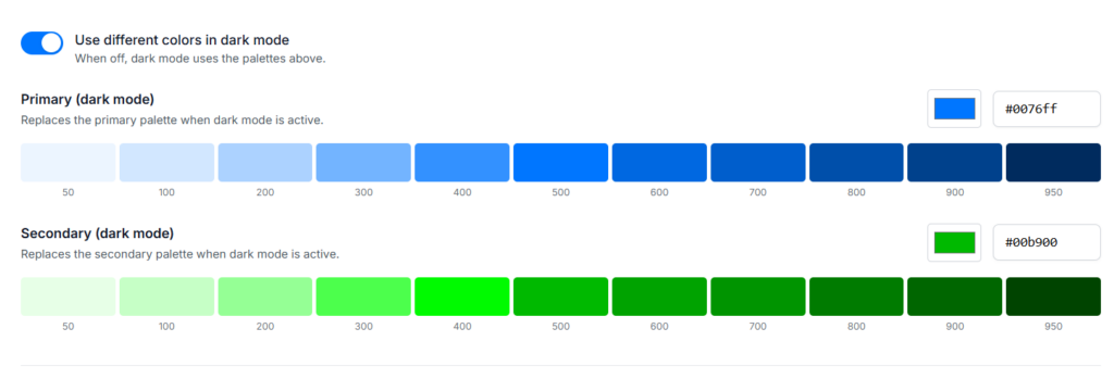
> Expected Result: The Dark mode section of the Live preview updates to use the new palettes, while Light mode stays the same.
Pro Tip: A common pattern is to keep the same hue but shift it slightly lighter and more saturated for dark mode, so text and buttons stay legible on dark backgrounds.
Choosing the Dark Mode Surface
The Dark mode surface section controls the gray tone WisePub uses for backgrounds, cards, borders, and dividers in dark mode. It has no effect on light mode.
There are five presets to choose from:
- Default: The stock Tailwind gray ramp. A cool, slightly blue tinted gray. This is the safe choice and matches the un-customised WisePub look.
- Neutral: A true neutral gray with no colour cast. Feels the cleanest and most modern.
- Zinc: A slightly cool gray with a faint blue tint. Sits between Default and Neutral.
- Stone: A warm gray with a subtle brown tint. Pairs well with earthy or warm brand palettes.
- Black: A very high contrast, near black surface. The most dramatic option, best paired with bright brand colours.
Click any preset to select it. The selected preset is outlined in your Primary colour.
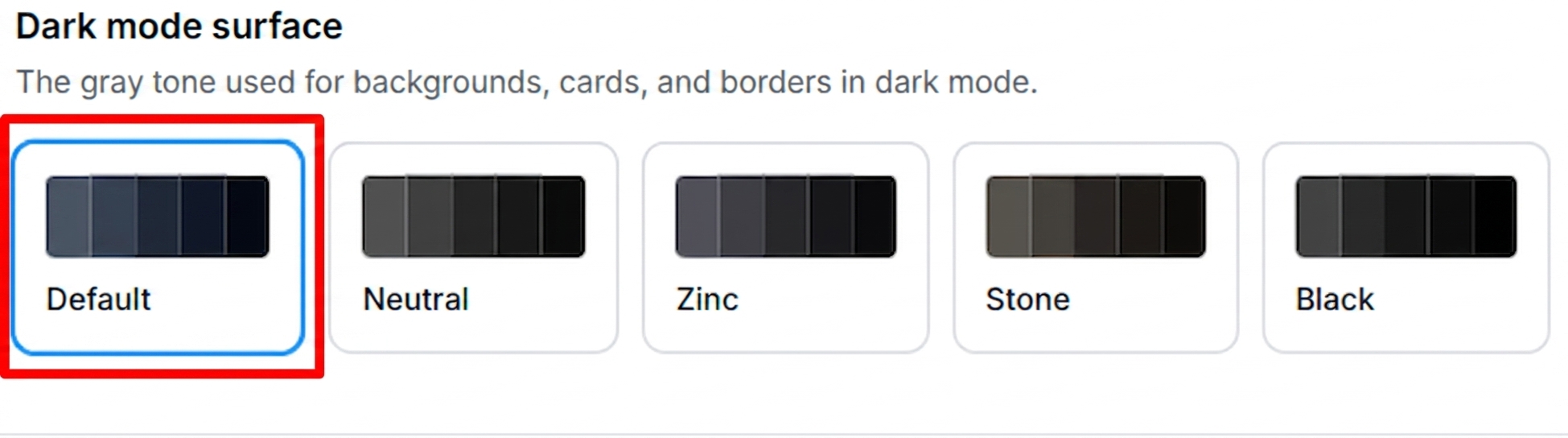
> Expected Result: The Dark mode section of the Live preview updates to use the new gray tone for its background and cards.
Pro Tip: If dark mode looks flat or lifeless, try Stone (warmer) or Neutral (cleaner) instead of Default. Small changes in the surface tone often make a bigger perceived difference than changing the Primary colour.
Using the Live Preview
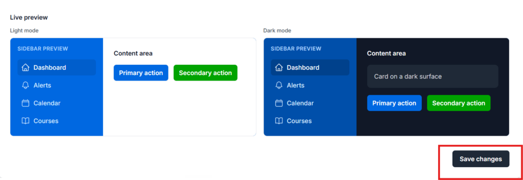
The Live preview panel on the right of the page always reflects your unsaved changes. It has two sections stacked vertically:
- Light mode: A mock sidebar plus a mock content area with a Primary and Secondary button.
- Dark mode: The same mock, rendered with the dark palettes and the selected dark surface.
You can safely try any combination of settings and see the result immediately. Nothing is applied to the real app until you click Save changes.
Saving Your Changes
When you are happy with the preview, click Save changes at the bottom of the preview panel.
> Expected Result: A “Saved.” confirmation appears next to the button, and the entire app (including the page you are on) instantly repaints in your new palette. No refresh needed.
Tips & Best Practices
- Start with Primary, then work outward. Get the Primary looking right before you touch Secondary or the sidebar. Everything else builds on it.
- Test both modes. Pick your palette, then switch your own theme between light and dark to see how it feels in real screens, not just the preview mock.
- Use the shade ramp. Once you know your Primary is `#0076ff`, the ramp gives you 11 usable shades. If a button looks too heavy, WisePub is likely using shade 600 or 700, which are derived from your base. Adjust the base slightly lighter to soften every shade at once.
- Sidebar overrides are worth trying. A dark navy sidebar with a bright Primary in the content area is a very common and effective combination.
- Dark mode surface matters more than you think. Try each of the five presets before committing. The gray tone underneath everything sets the mood of dark mode.
- You can always go back. Nothing is destructive. Try wild combinations in the preview, and if you dislike them, just change the values and save again.
Summary
Brand Colours turns WisePub into your brand, not ours:
- Pick a Primary and Secondary base colour, and let WisePub generate the ramps.
- Optionally override the sidebar colour if your Primary is too loud for a full height sidebar.
- Optionally define a completely different set of palettes for dark mode.
- Pick a gray tone for dark mode backgrounds and cards.
- Decide whether new visitors default to light or dark mode.
- Preview everything live, then save.
The whole app repaints instantly the moment you save, and any changes you make can be tuned again at any time.
Related Features
- Creating and Managing Navigation Menus: Menus sit inside the sidebar you just re-coloured, so they are a natural next step.
- How to insert buttons inside your content: Content buttons automatically use your Primary palette, so anything you insert will match the brand you just set.